“Media Bias” charts oversimplify a complex non-issue
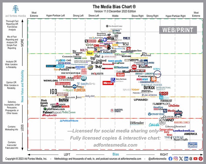
This goddamn chart:

I hate this thing. Twice per year, Ad Fontes Media releases these charts to help readers assess the “reliability” and “bias” of various media sources.
Because yes, trust in media is at an all-time low. But does that have anything to do with journalists’ “bias?” Trust in almost everything is at an all-time low. That’s just the nature of how people interact with institutions now.
These types of charts put all the onus on journalists and editors and completely remove readers from the equation. Which makes sense in some ways — newsrooms should be considered the authority, and the guy with a Simpsons’ profile picture on Twitter/X shouldn’t have any sway over how a story is written.
But, readers do control how stories are interpreted. Shaun Cammack has an amazing, now deleted, tweet thread on the Kenosha riots. In the thread, Cammack catalogs how the same story was interpreted by left-leaning readers and right-leaning readers, and which facts each group tended to hook onto. That story could come from one of the publishers in the center of Ad Fontes’ chart and be totally neutral in its language, if that’s even possible, but readers will still find a way to take it to a biased conclusion. Because duh.
The British Broadcasting Corporation, or BBC, is in the middle of this upside-down horseshoe so let’s take a closer look at it. Do you consider the BBC to be neutral?
In a 2018 survey, 40 percent of respondents considered it to be politically biased in some way. To the shock of no one, I’m sure. But what do those respondents mean exactly? Is the BBC biased towards the political left? The right? The Labour party, the Tories or a secret third thing? Well… it depends who you’re asking.
Because in that survey, 18 percent of respondents said the BBC is biased towards the right; but 22 percent of them believed that it was biased towards the opposite. So, net-net, you could consider the BBC to be slightly more biased towards the left. I guess.
Concluding that the BBC is biased based on these numbers is a hollow reading. The difference in people believing the BBC is left-leaning versus right-leaning is so marginal that it may as well be considered center. So maybe the Ad Fontes chart is correct. But that’s also not the full picture, right?
The truth is this survey is not a measurement of how biased the BBC is, even though that’s how it’s presented. It’s a measurement of how people perceive the BBC. And that’s arguably a more important metric than some arbitrary “media bias” score, but it’s almost never talked about. I mean, I had to go back to 2018 to even find a survey that summarized the results in this way. (Never mind the fact that Google sucks at surfacing relevant search results now…)
There’s another group — 24 percent — that don’t know if the BBC is biased one way or another, and 37 percent believed it to be truly neutral. Regardless, the largest group believed to be biased in some way, so that’s what the headlines will say.
The problem of “media bias” is overstated, if it even is one. These types of charts present a false dichotomy between journalistic reliability and partisanship.
/end rant
